

Data visualization (datavis) is the representation of data through graphical tools like graphs, infographics and animations. The idea is to communicate complex data relationships and data insights in an easy to understand way. This makes it pretty important then for that vital link between digital operations and senior management decision making.
What are the ethical problems with datavis though, some of you may be thinking. Everyone loves a good infographic; they’re so easy to engage with and understand. Yet at the same time, that ‘...easy to engage with and understand’ bit can be exploited in ways that undermine trust, both within and outside of a firm.
What do I mean by this? Well, take the case of the infamous ‘gun deaths in Florida’ graph...
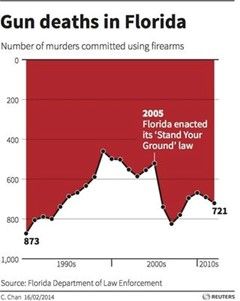
It looked like gun deaths had fallen steeply after a 2005 change in legislation. Yet those who looked more closely saw that the vertical axis had been inverted (with 1000 at the bottom and 0 at the top). In reality, gun deaths had soared. Through certain design choices in the data’s visualisation, an attempt was made to communicate a completely different story. This is what the ethics of data visualisation deals with.
Two Types of Value
I’m going to take a common description of data visualisation and, as is my habit, turn it around. People often talk about datavis as unlocking ‘key values’ in massive amounts of data, making those values clear and visible. That’s fine, but it’s also important that the way in which this is done locks in values of an ethical nature.
Those ethical values matter because a lot can often hang on the decisions that are based upon the insight drawn from big data. The way in which datavis people chose to simplify the complexity of that data, and the way in which this can then shape perceptions and interpretations – such choices have ethical dimensions to them.
So the data in the ‘gun deaths in Florida’ graph may have been accurate but the design of the graph was misleading and deceptive. It failed to correctly represent the underlying data and so was judged to have been dishonest. The wider consequences of manipulative practices like this are poor decision making and an erosion in trust.
Business Decisions
This is not just about eroding trust with outside audiences. Most data visualisations are created for internal consumption only, and manipulative datavis can undermine the decisions being made by boards and management. That’s not good for the bottom line. So there’s a good business case for paying attention to the ethical side of data visualisation.
So what are the ethical values to be respected by datavis people? Every insurer has their own set of ethical values and those are the ones that datavis people should pay immediate attention to. On top of those corporate ethical values are the regulatory principles that the insurer needs to abide by. In reality of course, there’s a lot of overlap between the two, and with peoples’ own personal values too.
In overall terms, the most common ethical values circulating round insurance firms are honesty, fairness and respect. Clearly, these three values will be expressed in different ways (unbiased instead of respect, for example), but all in all, those three are a pretty solid starting point.
After deciding on the ethical values that should influence their work, datavis people then need to identify the guidelines for how each of those ethical values should be put to use. So with honesty, how should it guide each of the data collection, analysis and design stages? I won’t go into this in any more detail, for we need to now look at another ethical dimension to data visualisation.
Applying Perspective
I’m doing to explain this further ethical dimension to datavis through an example firmly based within recent events in UK insurance. In December 2015, a team of behavioural economists at the FCA published the results of a field trial recently conducted into household insurance pricing. Inside their report was the following graph...
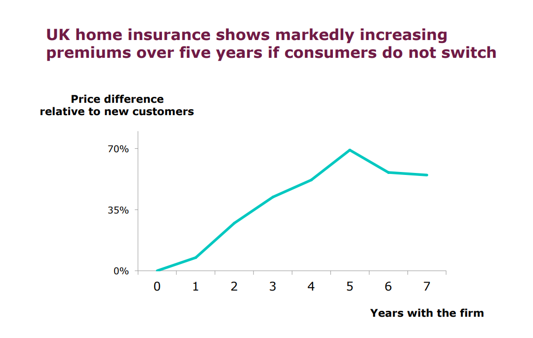
To all intents and purposes, this looks a pretty straight forward graph. Yet it had little to no impact within the regulator. Several months later, their report on big data and pricing made no mention of it. Fast forward to April 2018 and an article by me about the implications of that ‘average of 70% at 5 years’ data point. Shortly afterwards, a radio consumer programme rang me to discuss my article. They had been very surprised by the graph, finding it extraordinary that household insurance was being priced in this way.
So we had one set of people who didn’t see anything wrong in this graph, and another set whose eyes went out on stalks. Why the difference? Clearly, the difference in perception was driven by the mindset with which each set of people was ‘seeing’ the graph. The data scientists saw the same thing as the consumer people, but drew different significances from it. In a sense, this reinforces the point that no data visualisation is objective ; all data visualisation is subjective.
This means that insurance people need to vigilant, perhaps even a bit challenging, when it comes to reading data visualisations. They have to think about both what’s in front of them (the graph) and what is behind it (the purpose). Tricky? A bit, for sure, but remember we think about a lot of things in our personal life on more than one level.
Less Subjective
This then begs the question: what can I do to move my datavis more towards the objective side of things? One way I think should be seriously considered is to think about how your datavis reflects actual real world outcomes. To illustrate what I mean by this, let’s return to the household pricing graph above. One output from the FCA’s pricing review following the 2018 super-compliant was that the older the policyholder, the more their price had been walked. Remember that 70% at 5 years was not only the average across all insurers, but also across all age groups. This means that older people were being exposed to far higher percentages.
Now, you can look at those 70%+ figures as an amount in pounds, which is what most economists tend to do. Another way to look at those 70%+ figures is from the perspective of those most impacted by them, being pensioners. Instead of having a Y axis formatted as a percentage of an average premium, a more representative way would have been to convert that percentage into a number of ‘weeks pension’. In other words, for the people most impacted, how many weeks pension did elderly policyholders have to forego in order to pay the ‘walked premium’ of 70% or more?
This alters the perspective completely, from being about a simple monetary sum, to being about a loss of income. It moves the perspective from being about outputs (% premium more), to being about outcomes (pension lost). Yet the underlying data (many amounts of ‘this amount paid for that person’s policy’) stays the same.
Regulatory economists saw the output, while consumer groups saw the outcome. Insurers need to see both, for pricing and settlement practices are under scrutiny from both directions.
To Sum Up
Data visualisation is not neutral. It always contains, or omits, some aspect of judgement. This can happen more towards the technical end of datavis (such as the deceptive design of the gun deaths graph) and it can happen more towards the social end of datavis (outcomes like pension weeks lost).
Board and senior management need to remember that data visualisations can be both easy to engage with, and easy to get sucked into. No matter how engaging an infographic might look, a critical mind is always needed to weigh up its implications.
To my mind, datavis needs to conform with the ethical values of the person creating it, of the firm for whom it is being created and of the people who will be basing decisions upon it. That’s the baseline. Beyond that, there’s a discussion to be had around the role that datavis plays in capturing the world out there, and capturing the trust of those in it: the public.